thoughts, comments and or suggestions greatly appreciated
thx
.gif "Smile")
(I don't know why they UL like this, but the edges really aren't cut off
.gif "confused") )
)Maybe make the bottom text a little smaller?
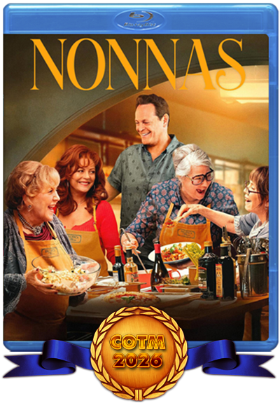
![]() by hbbyhorse » Fri Apr 25, 2025 3:49 am
by hbbyhorse » Fri Apr 25, 2025 3:49 am
)

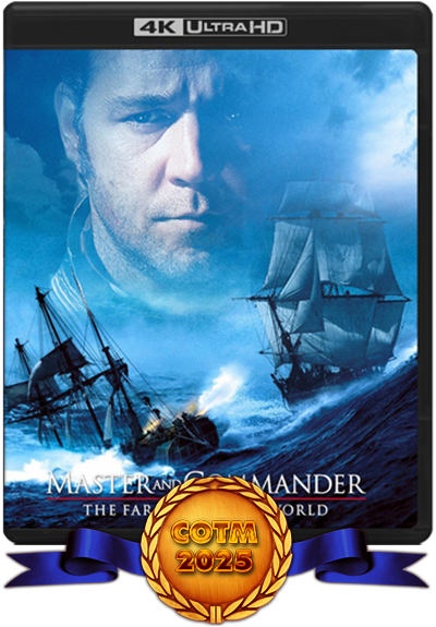
![]() by Wrench » Fri Apr 25, 2025 10:11 pm
by Wrench » Fri Apr 25, 2025 10:11 pm


![]() by hbbyhorse » Sat Apr 26, 2025 12:07 am
by hbbyhorse » Sat Apr 26, 2025 12:07 am
Wrench wrote:Look at the labels that BajeeZa or myself posts, the copyright is smaller and less info.
You need © year, Studio name, All Rights Reserved, No copping ( if you want that) and I put Rated (whatever the rating is).
To much info makes it to long and can run off the disc area if it's not centered.
Return to W.I.P. - Works In Progress
Topic Title |
Views |
Replies |
Topic Author |
Forum Section |
|---|---|---|---|---|
| Futureworld 1976 Scan or Custom - BD | 164 | 0 | nightmareman81 | Requests Covers/Labels |
| The Ruins (2008) - Custom - BD | 763 | 0 | nauticool | Requests Covers/Labels |
| Tusk - Scan or custom - BD | 2687 | 0 | nauticool | Requests Covers/Labels |
| The House That Jack Built, Scan or custom (not picky), BD | 147 | 0 | nauticool | Requests Covers/Labels |
| • Metallica - S&M • "Custom" • BD • | 3363 | 1 | mpeters590 | Filled Requests |
Users browsing this forum: No registered users and 1 guest